University Symbols
![]()
![]() Symbolmark
Symbolmark

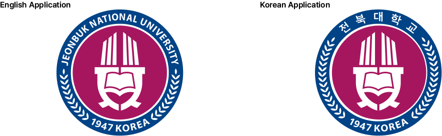
- The symbol mark is the basic and core element that symbolizes Jeonbuk National University. It is not only a phenomenon that changes the image or design of the school, but also includes organizational reform and the development process of the school. It goes beyond simply being aesthetically pleasing and introduces the concept of beauty into school activities to develop cultural and intangible information value that is one level higher.
- The U-shaped background of the symbol mark is derived from the traditional patterns of Baekje, symbolizing the long tradition and authenticity of Jeonbuk National University, while the shape extending toward the sky suggests the future development of JBNU.
- The symbol mark is the official mark of JBNU and is widely used in all visual communication media, playing a central role in communication between universities. Therefore, if errors occur due to carelessness in use, the image of JBNU will be given an inaccurate impression, so it requires careful attention in use and cannot be modified, altered, or edited at will. To use the symbol mark, download the production data from the Jeonbuk National University website or get the cooperation of the UI department. When producing special media that require an enlarged symbol mark, such as large signs, electronic signs, and banners, except for reproduction by printing, use the grid provided for accurate reproduction and maintain the correct proportions according to the system drawing method.
![]()
![]() Emblem
Emblem

- The symbol mark and English logotype are combined to create a school emblem, which is used when it is necessary to symbolize the authority and tradition of a school (e.g., a school emblem, decoration for a memorial ceremony). It can be seen as a signature derived from the symbol.
- This is an example of the Korean logo type applied to the emblem. The usage rules are the same as those for the English emblem, but it cannot be used in preference to the English emblem in order to maintain a consistent identity.
![]()
![]() Logotype - 1
Logotype - 1
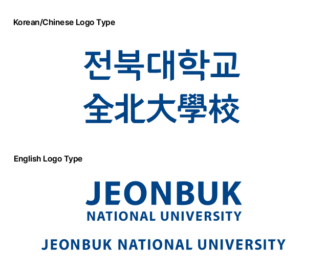
- The logotype of Jeonbuk National University maintains consistency with the exclusive font of JBNU and is designed to retain the authentic Gothic taste while maintaining a soft aesthetic.
- The English logotype was applied and created based on the Universe font. When reproducing it, the spacing and proportions must be accurately matched according to the grid system.
![]()
![]() Logotype - 2
Logotype - 2
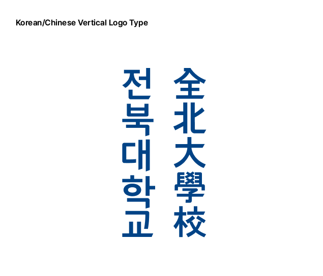
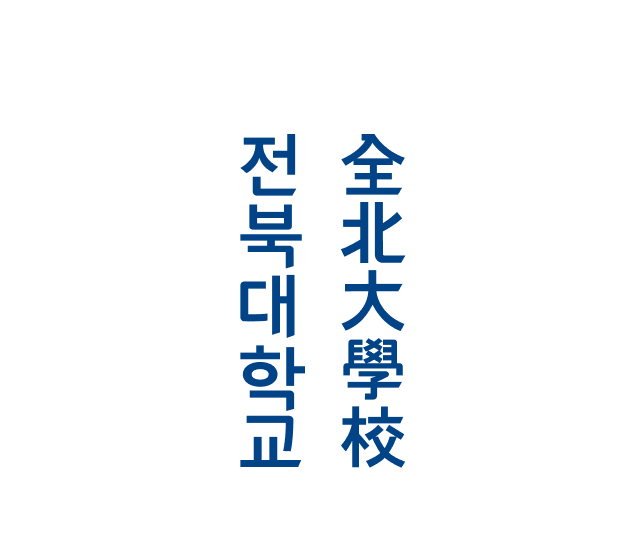
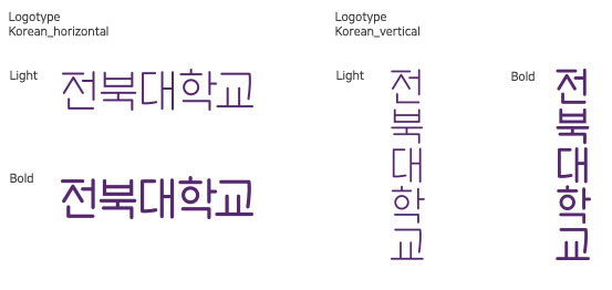
- Korean and Chinese characters Logotype The vertical combination of the logotype was created to achieve the most ideal balance when the logotype is combined in a vertical form, and it is differentiated from the horizontal combination. The horizontal combination of the logotype should not be used as a vertical variation, and the following examples should be followed exactly. Do not use the vertical combination of English characters.
![]()
![]() Emblem Basic Type
Emblem Basic Type

- The center represents Jeonbuk National University, a world-renowned university with an enterprising, cultural character and creative intellect, by symbolizing the number 60, which represents the 60th anniversary of the university's founding, with the English word "GO." The four dots on the left represent the light of the sun, symbolizing the future, and express the future vision of JBNU, a creative university that will grow into great talent and contribute to the development of the region, the nation, and human society. The English catchphrase was added to this. The official logo for the 60th anniversary of the opening of Jeonbuk National University is widely used in all visual communication media (large signs, electronic displays, banners, printed materials, etc.).
![]()
![]() Emblem Application Type 1
Emblem Application Type 1

- Emblem Combine the basic type with Korean/English catchphrases to express the tradition and vision of our university (jangpyo-ryu, commemorative ceremony hall decorations, banners, etc.)

- Consists of a 60th anniversary emblem and catchphrase.
- If it is reduced to 20 mm or less, the English letters on the border may appear crushed or sloppy when printed, so use 20 mm or more.
![]()
![]() Emblem Application Type 2
Emblem Application Type 2

- Emblem A combination of the basic form and Korean/English catchphrase to express the tradition and vision of our university.
- Used for banners, decorations for memorial ceremonies, etc.

- The design of the emblem is an application of the existing university symbol mark, so the colors of the 60th anniversary symbol mark are also simplified to avoid making the design too complicated.
![]()
![]() Emblem Application Type 3
Emblem Application Type 3
- The combination of the basic emblem and the catchphrase and logotype is effective in achieving an ideal harmony, conveying the image and message of the 60th anniversary of the school's opening.
- Used on promotional stickers, souvenirs, printed materials, etc.

- Composed by attaching the basic emblem, catchphrase, and logotype
※ All content posted on this site is protected by copyright and trademark registration, and any external party who reproduces, modifies, or uses all or part of the content for purposes other than promoting Jeonbuk National University without the written approval of JBNU will be subject to criminal charges or claims for damages under the Copyright Act and Trademark Registration Act.
![]()
![]() Basic
Basic
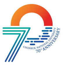
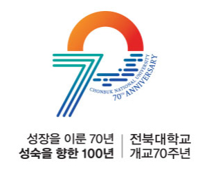
- The number '7' in the 70th anniversary symbolizes the blue sea that symbolizes the bright future of Jeonbuk National University, and the '0' symbolizes the blue sea and the rising sun over the waves, embodying the spirit of Jeonbuk National University.
![]()
![]() Color System
Color System

- The emblem of Jeonbuk National University's 70th anniversary uses the gradation technique. Blue represents the blue sea, which symbolizes a bright future, and red represents the rising red sun over the blue sea waves, expressing the strong spirit of Jeonbuk National University in the emblem.
![]()
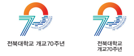
![]() Logo Type / Horizontal, Vertical
Logo Type / Horizontal, Vertical
![]()
![]() Catchphrase
Catchphrase


- The catchphrase reflects the company's 70th anniversary of growth and the opening of the next 100 years of maturity.
![]()
![]() Application-type Signature-1
Application-type Signature-1
![]()
![]() Application-type Signature-2
Application-type Signature-2
※ All content posted on this site is protected by copyright and trademark registration, and any external party who reproduces, modifies, or uses all or part of the content for purposes other than promoting Jeonbuk National University without the written approval of JBNU will be subject to criminal charges or claims for damages under the Copyright Act and Trademark Registration Act.
![]()
![]() Symbol
Symbol

- The symbol of Jeonbuk National University represents balance and harmony, as well as the direction and goals toward intelligence and ideals. It visualizes the restrained beauty of Korea through simplicity and white space, and in accordance with the direction of the symbol, it symbolizes the Department of Philosophy's vision of "Jeonbuk National University advancing beyond growth to maturity," which includes the meanings of a Korean university, a university devoted to scholarship, and a university advancing toward the future.
![]()
![]() Logotype Korean
Logotype Korean
- The logo type of JBNU was developed in consideration of the symbolic identity and readability of the symbol.
![]()
![]() Logotype Signature
Logotype Signature
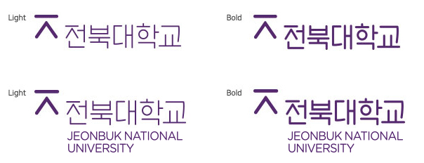
- The signature combination that represents the identity of Jeonbuk National University is a form created by considering the most harmonious shape and proportion in consideration of the visual elements of the symbol and logotype. It is a visual that can communicate most actively by simultaneously representing the symbol and information.
![]()
![]() Color Palette
Color Palette
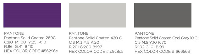
- Color is the first visual element that is recognized among various graphic elements. Therefore, the regulations and principles of the manual must be strictly observed to ensure accurate color reproduction. Spot color printing is the principle for printing, but CMYK four-color printing is also possible depending on the characteristics of the dedicated medium. There may be slight differences in color reproduction depending on the printing method, density, and paper quality.
For accurate color expression, you should refer to the standard colors presented in the guidelines.
※ The UI of JBNU must comply with the rules and principles specified in the attached manual. It must not be interpreted arbitrarily or used after changing the content, and it must not be reproduced, altered, or used in whole or in part without the permission of JBNU.